Summary

Cabinet materials
Wood Polymer
Designer(s)
Laurie Bonin-Gohier

The Havre Kitchen

Contemporary Kitchen

Here is one of our latest contemporary creations inspired by Mid-Century Modern design. The contemporary kitchen adapts ergonomically to the needs of its occupants. Its style is sleek with all the practical aspects of everyday life. Storage spaces hidden behind panels streamline the space by keeping the essentials close at hand.

This kitchen is the creation of our designer Laurie Bonin-Gohier. She created a warm space for her family in shades of warm grey inspired by the surrounding nature of the Laurentians where they live.

The kitchen island is the focal point, reminiscent of the days when we all gathered in the kitchen to chat, this island welcomes guests for appetizers. The Noctis Quartz countertop offers a full surface to maximize workspace and the rounded corners are a nod to the 50s that Laurie loves.

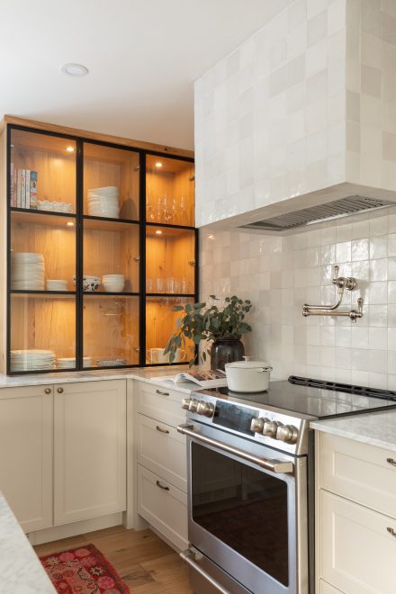
A concealed coffee corner in the cupboard unit is as practical as it is harmonious with integrated lights in a dark tone. Open or closed, it is equally pleasing. The space is softly bathed in natural light, decorated with branches or natural flowers picked around the house.

A black aluminum and fluted glass door cabinet Ateliers Jacob.
Black and white kitchen with island from Ateliers Jacob

Design

The suede hue chosen for the Evoke collection of wall units and overhead cabinets is soothing and creates a calm atmosphere. The raised pale-coloured cabinets lighten the room and reflect the ambient light. The ultra-matt finishes bring softness to the materials, providing an overall sense of comfort.

The PE oak slat island with rounded corners is inspired by details of the 50s and 60s architecture. Combined with the fluted glass door cellar, the materials give the kitchen its own personality. 

Simple and functional, L-shaped kitchens are very popular. The addition of an island makes it a very practical configuration. This type of design is also seen in smaller spaces to free up the passageway without compromising the counter space. Typically, there are cabinets on two adjacent walls, one shorter than the other, hence the L-shape.

Our advice would be to group the wall units on the shorter section, integrate the fridge, pantry cabinets or even a coffee corner as shown in the photos and keep the longer section for work and counter space.

The configuration of this L-shaped kitchen was designed to leave the entire surface of the island free to become a central counter dedicated to preparing dishes and cocktails.