
Hello, it’s a great day to start a project.
Discover the 8 trendy colours of 2025, celebrating the beauty of nature in all its forms.
Text : Marie Charles Pelletier
This year, natural elements take centre stage in interior design, with colours that soothe the spirit, warm the heart and promote well-being. These deeply nuanced hues resonate with our emotions and our innate connection to nature. From lush greens to earthy browns and calming neutrals, here’s a selection of this year’s trending shades, how they influence our daily lives, and how to integrate them into your home.
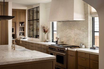
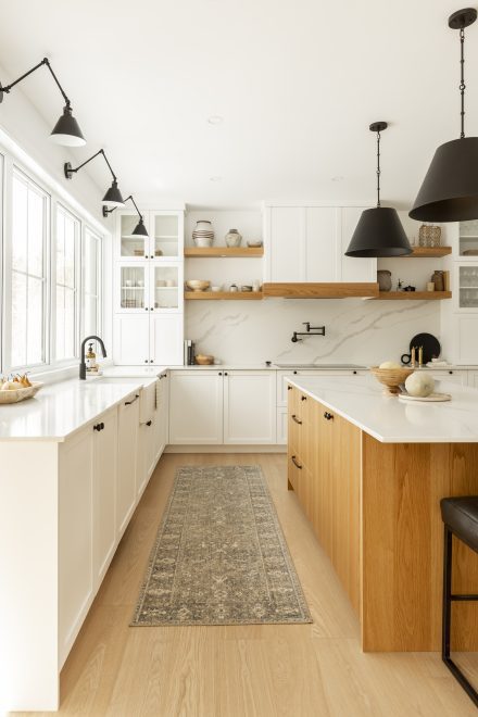
This deep green mirrors the dense foliage and the organic richness of forest floors. Its natural depth anchors us in space, exuding a serene and grounding energy. BEHR’s Garden Cucumber closely captures this essence, evoking a peaceful walk among the trees at dusk. According to Pinterest Trends 2025, this shade is one of the biggest trends of the year, proving its growing appeal, as revealed by keyword analysis of the billions of searches carried out on the platform.
Psychological effect: Like a bridge to nature, green encourages relaxation and stimulates creativity, creating a calm yet confident environment.
How to use it: Use it on accent walls, cabinets or a kitchen island. It pairs perfectly with brass hardware, wood floors and rich textiles for a luxurious, organic ambience.

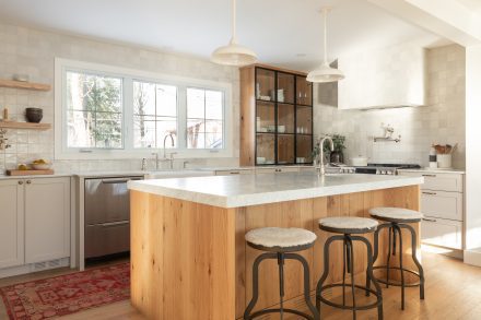
HGTV Home by Sherwin-Williams’ Colour of the Year 2025, Quietude (HGSW 7004) , is a soft sage green that exudes the freshness and calm of open spaces. Part of the “Naturally Refined” collection, this muted green reflects a collective desire for simplicity and slow living. Elegant and discreet, it naturally invites a sense of peace and mindfulness.
Psychological effect: This shade soothes the mind and encourages a slower, more intentional lifestyle.
How to use it: Quiétude is ideal for calm bedrooms and living rooms. It pairs harmoniously with light wood tones and natural fabrics to create a warm, comforting space.
A standout from the HGTV Home 2025 collection by Sherwin-Williams, Snowbound (HGSW7004) captures the crisp, delicate beauty of a winter morning. Its soft white tone, subtly infused with warmth, reflects the gentle glow of sunlight over freshly fallen snow, creating an atmosphere that is both bright and inviting.
Psychological effect: White invites a feeling of simplicity, giving the space a sense of grandeur and calm.
How to use it: Consider using it on walls, ceilings and furniture, pairing it with natural materials such as linen or light wood to create a timeless, cozy atmosphere.
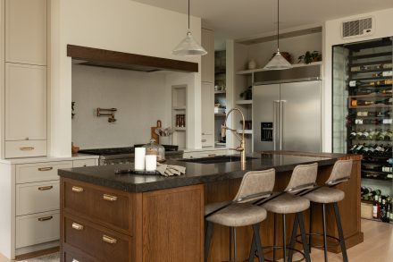
This dark gray by Benjamin Moore is inspired by the timeless strength of rock formations. Named after anthracite coal—renowned for its durability—this shade pays homage to rugged cliffs, granite landscapes, and the raw beauty of nature.
Psychological effect: This deep gray conveys stability, permanence and elegance. It lends the room a reassuring, refined atmosphere that stands the test of time.
How to use it: Ideal for accent walls to create a focal point, or use it with light shades and raw materials such as wood, stone, concrete, or with gold or metallic elements for a more modern feel.
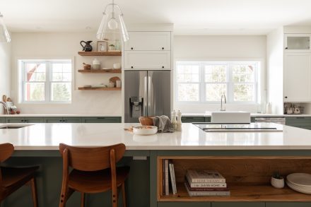
This rich green embodies the essence of temperate forests and wooded landscapes, recalling the silhouette of solitary pine trees rising from hillsides. From Benjamin Moore’s Colour Trends 2025 palette, it invites introspection and our connection to nature, infusing every space with a soothing, organic atmosphere.
Psychological impact: A symbol of resilience and strength, this shade of green transforms any room into a peaceful retreat.
How to use it: Perfect for meditation areas or offices, it pairs well with natural materials like light wood and woolen textiles.
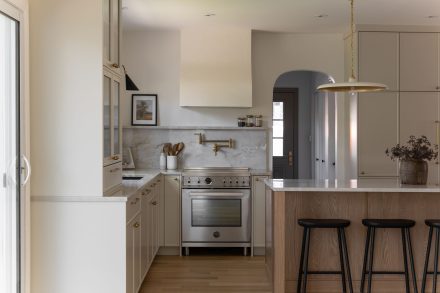
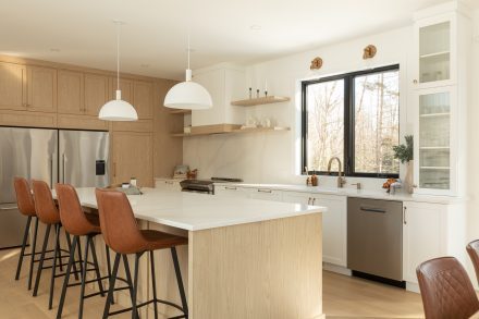
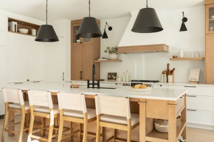
Graham & Brown’s Colour of the Year 2025, Elderton, is a sophisticated, warm brown inspired by elder treefoliage. This timeless, neutral tone exudes discreet beauty that remains relevant beyond fleeting trends.
Psychological effect: Grounded in tradition, Elderton evokes warmth and stimulates creativity. Browns, naturally reminiscent of the earth, help create a sense of timelessness.
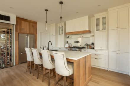
How to use it: This shade is perfect for intimate spaces like an office or powder room, where the aim is to create a sense of coziness in a soothing atmosphere. It also works beautifully in kitchens, adding a touch of character while remaining subtle and neutral.
Dunn-Edwards’ Colour of the Year 2025 (DET687) is a terracotta brown reminiscent of sunbaked landscapes, artisan pottery, and neutral clays. Its soft, earthy tones evoke the warmth of sun-dried clay and complement vintage-inspired interiors as well as sleek, modern spaces.
Psychological impact: The warmth emanating from this sophisticated brown evokes the nostalgia of raw materials and their authentic beauty, creating a feeling of comfort and conviviality.
How to use it: This shade is ideal for kitchens, bedrooms or dining rooms. Consider combining it with raw wood furniture and handcrafted ceramics to recreate the essence of Mediterranean charm.
BEHR’s Kalahari Sunset (MQ1-25) captures the warmth of a desert sunset, radiating a golden terracotta glow that is both energizing and comforting. It brings a dynamic yet soothing presence to any space, reflecting the raw beauty of sunlit dunes..
Psychological impact: Earthy reds channel stability and warmth while revitalizing a space with new energy..
How to use it: Ideal in minimalist spaces, it pairs beautifully with warm woods and soft beige tones. If you prefer a subtle touch, introduce it through accessories like cushions, rugs or terracotta pottery.
The colour trends of 2025 invite us to slow down and surround ourselves with hues that resonate with our deep connection to nature and a return to basics. Whether it’s the calm of sage green, the depth of anthracite grey or the warmth of earthy browns, these colours create homes that feel like true sanctuaries—where we can pause, breathe, and reconnect with the world around us.


